Every time you upload a photo to social media you are presented with the option to apply a filter. Each filter does something different but almost all in some way affect the appearance of colour. Filters can be fantastic as they allow you to maintain a consistency to your images. They should though be used with care especially with commercial imagery or images you did not take yourself.
What is a filter
A filter simply put is a set of instructions applied to a photo changing exposure, contrast and colour amongst other details.
Those that make changes to colour especially tonally can actually be quite damaging if the image is to be used commercially.
Do photographers use filters?
Yes and no, personally I do not use a filter in the way most people think of them on social media. What I use is personal ‘pre-sets’, or instructions relating to contrast, colour, exposure and more. These are applied to my raw photos straight from my camera before I edit them in detail individually.
I have a collection of different pre-sets that I use according to the type of session and the lighting involved. The one I use for weddings I wouldn’t use for commercial work.
You can purchase presets but all of mine I have created myself. Some photographers will use presets that are natural, others that dramatically change colours, tones and contrast.

This collage shows the difference between my different editing presets and a filter compared to the original image. My commercial edit does not change the colours or tones. My wedding edit very slightly (neglible in this case) adjusts tones, and the filter completely changes the colours.
So why is colour so important?
When you are purchasing items online you want to see what colour the item is. If it’s going to be matching another item you want to know what colour it is going to be. Now there is an added complication of a screen being calibrated but there should be a presumption when producing imagery that a viewer’s screen is calibrated. If a screen isn’t calibrated colours can show incorrectly. You don’t have control over non calibrated screens, but if you are correct for calibrated screens you can’t go far wrong.
It’s not just important when a client is looking for a matching colour but just in general. If a client is expecting a moody reddy purple pair of trousers but a bright red pair appear they will be disappointed. You do not want disappointed clients when you have the ability to avoid it!
Another consideration is consistent colour. If images within your marketing set are of different colour tones it looks messy and unprofessional. Consistency is key.

Without a filter the jacket is its real blue colour, with a filter it is now a murky green. If customers see the right image and order but receive the left they may not be impressed. Make sure marketing images match your products. Each image on it’s own you likely wouldn’t notice the difference but side by side it’s stark.
Does anything else affect colour?
Yes it is not just a preset or filter that can affect the colour of an image, but also white balance and light colour.
Different light sources produce different colours of light and even daylight varies. An overcast day will be more blue but closest to pure white light, whereas near sunrise or sunset will produces orange tones. Artificial lighting varies and you will often see lights being marketed as blue, warm or white light. All have their advantages but for product photography you normally want neutral light.
An item doesn’t change colour because of the light reflecting on/off the product. Our eyes and brains just perceive the colour differently. Have you ever stood under one of those orange street lights in the otherwise pitch black? Everything looks orange! Not because things have changed colour, but the light source is so orange your brain can’t process the true colour.
Images should be shot preferably in neutral light as that will allow the viewer the best chance to correctly interpret the colour.
White balance is how an image is photographed/edited to reflect the ambient light colour. It allows the image to be adjusted to produce a natural as possible result colour wise.
If there are two different colours of light sources involved the eye can be tricked and misled. Our eyes are quite good at compensating in real life adjusting white balance according to where you focus your vision. Photographs though can only be taken with one white balance setting and if it is wrong it can be confusing. The best example of this is the now infamous Blue & black dress that went viral as people couldn’t agree on the colours. The reason came down to the image being over exposed with incorrect colour balance and two different light sources. All these factors together meant the colour was very misleading.


The above images show the difference created by two different light sources. The right before image shows the interior light was warmer than the exterior making the outside quite blue and cool. You can really see it in the areas surrounding the white highlights. I edited the image to balance and warm the exterior light to match that of the interior.
The colour difference for portrait and commercial photography
Portrait photography is selling an experience and a feeling, whereas commercial photography is generally selling a product. If a product is selling a service, there is more creative freedom to how images can be edited. A style can be used to fit the brand. If there is a product, there is a clear need for colours to be correct for the product itself.
It’s for this reason my wedding and portrait photography although close to a neutral edit have some slight tonal changes.These changes allow me to create my personal style for my photos. This style can be clearly seen when looking at my portfolio. All my event images and commercial work though have a clean neutral edit. For commercial shoots involving products I spend a significant amount of time to get a colour match. I want it as close a match as possible to the real product colour under neutral light. There are no moody looks, no colour tints or similar.

The difference between my commercial and portrait edits is actually quite minimal. I just like a bit more of a contrasty look with a matte effect and almost slightly muddy rustic tones. Overall there is very little change to colours. For some photographers the difference between their portrait and clean commercial edits can be quite striking. Make sure it is communicated in advance how you want your images edited.
Using multiple image sources and photographers
If as a brand you regularly use multiple photographers, or image sources, it is always advisable to opt for a natural clean edit. If each photographer uses their style on images when put up against one another they will look mismatched and inconsistent. This can look unprofessional and could reflect badly on your business.
It is OK to want a certain style to your imagery as long as you understand the implications. To do so you will need to either provide all photographers with a preset. Alternatively acquire editing rights to the imagery and apply a matching filter when you receive the images. Personally I would use a single photographer to insure consistency, and have them recreate any current imagery in your style. You should never ever apply a filter to an image provided by someone else without permission. This includes from a photographer you have commissioned. To apply an edit, even ‘just’ a filter would be infringing copyright. Don’t do it, get permission first!
I discussed the importance of original imagery previously. If you have imagery created for you specifically then you have far more control over the final appearance.
Is there really a difference as I can’t see it?
Often any changes to a clean neutral edit can be quite subtle but when placed side by side it can be quite dramatic. A more yellow warming tone creates a romantic feel. A bluer tone can achieve a calming effect.
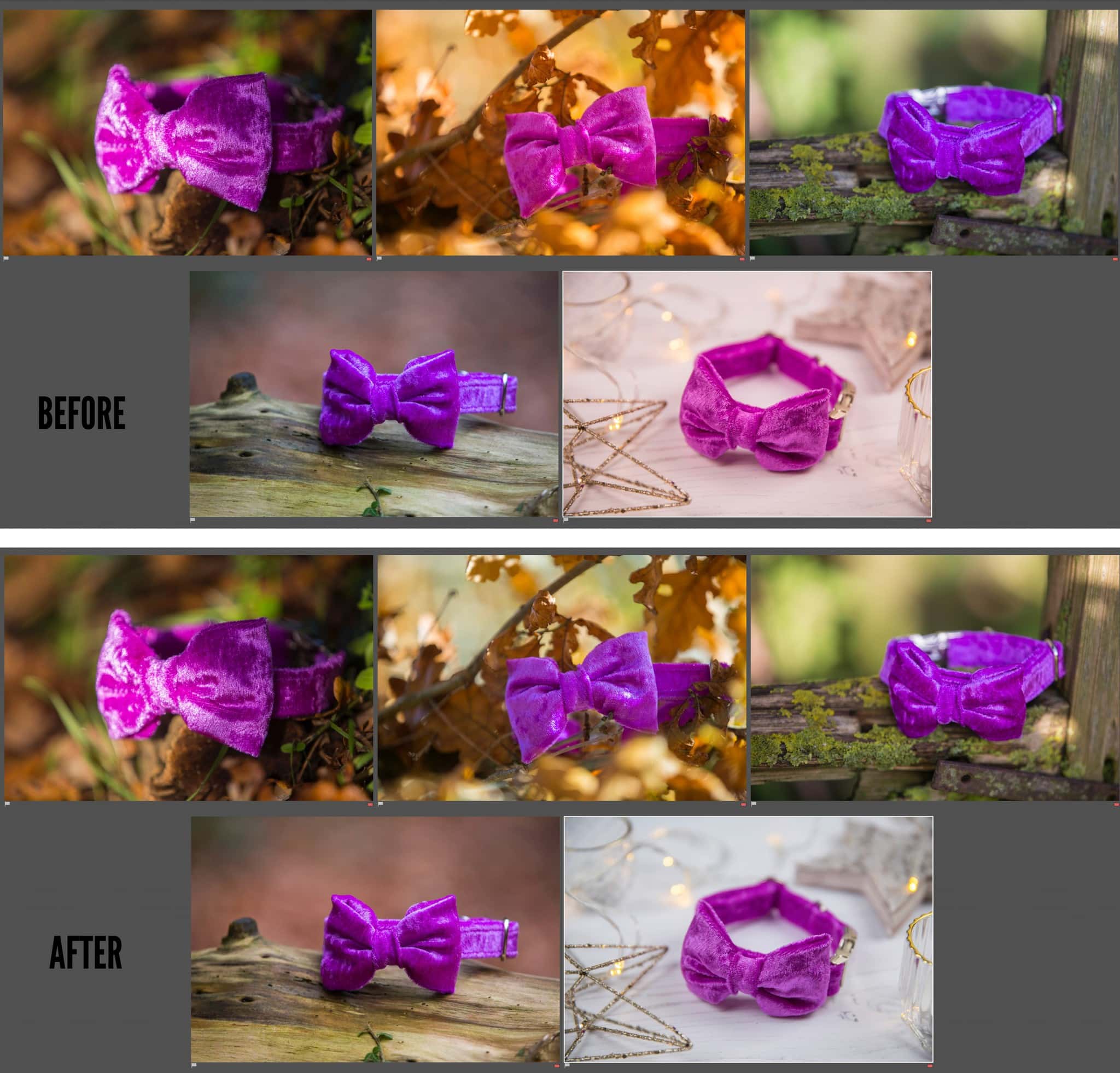
If you have several photos of the same product side by side it soon becomes clear if colouring is different. If it is it can be very confusing for the customer and it may even stop them from purchasing.
The right/below images show multiple examples of different lighting and how it affects the colour of the product in this case a dog collar. The before images could be of several different collars if you didn’t know better. The after images were matched (as far as possible) to an accurate colour representation.

Where to start?
Overall achieving correct and consistent colours should not be a problem for a professional photographer. But ensure that everyone is on the same page as to what editing is wanted for images before any photo shoots take place. Agreeing in advance prevents any nasty surprises, including additional editing fees.
If you are a brand owner, take the time to audit your existing images to check they are accurate and consistent. Make sure to check on a calibrated monitor when checking accuracy! Just looking at your Instagram grid is a great way to start looking at consistency. Do all the images look like they have similar editing styles? I haven’t worked with them but I love Half Halt for their consistency across their Instagram and website imagery.
Do you want to learn more about commercial imagery?
In addition to providing commercial imagery for businesses I provide training to photographers looking to improve their photography offering to their clients.


